MY PERSONAL BRANDING
Logo Design | Branding | 2024-Present
PROJECT
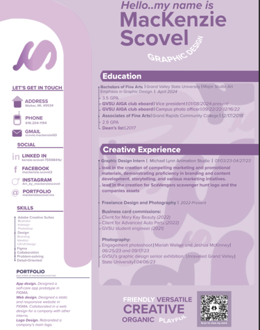
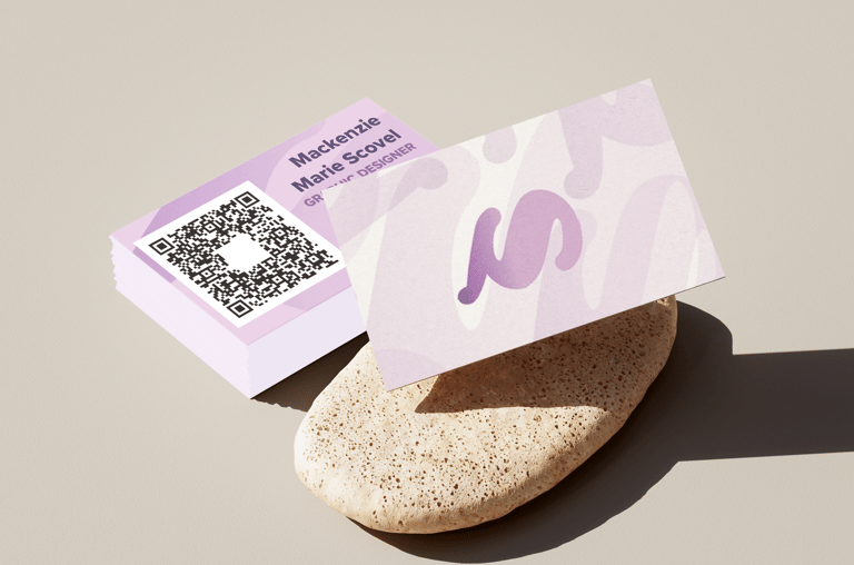
Your personal brand is remarkably Cohesive, Optimistic, and Professionally Playful, anchored by a consistent visual identity. The soft purple palette and distinctive 'M' logo are leveraged across all materials—the resume, mobile site, and business cards—to create an accessible and memorable aesthetic. The design is strategically organized for clarity, using color blocking on the resume and a mobile-first approach on the website. This visual polish is perfectly complemented by your explicit brand persona, which emphasizes quirkiness, optimism, and a storytelling approach, ensuring your work is seen as both strategically sound and creatively engaging.

DESIGN DIRECTION
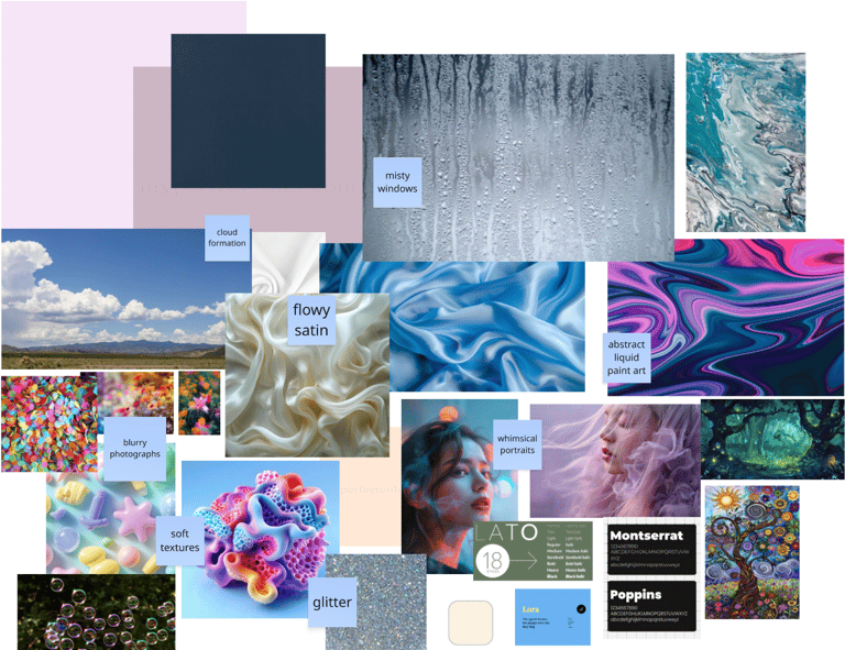
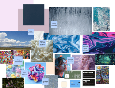
Based on my design vision and the materials I've put together, the overarching brand direction I'm pursuing is Whimsical Modernism. This style is a direct blend of two concepts: the organic and expressive qualities from my moodboard and the clean, professional structure I need for my portfolio. I use a soft, consistent purple palette across everything—from the background forms on my website to my logo and resume. This aesthetic pulls inspiration from the 'flowy satin' and 'abstract liquid paint' concepts in my moodboard, giving my digital space a friendly, artistic, and optimistic personality. At the same time, the website and resume layouts use ample white space and clear hierarchy to maintain a professional standard. This ensures that while the design is expressive, the user experience is always intuitive and strategic, helping me achieve my goal of being a designer who blends storytelling with strategy.

FINAL LOGO
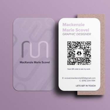
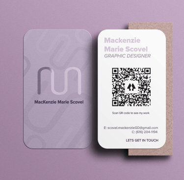
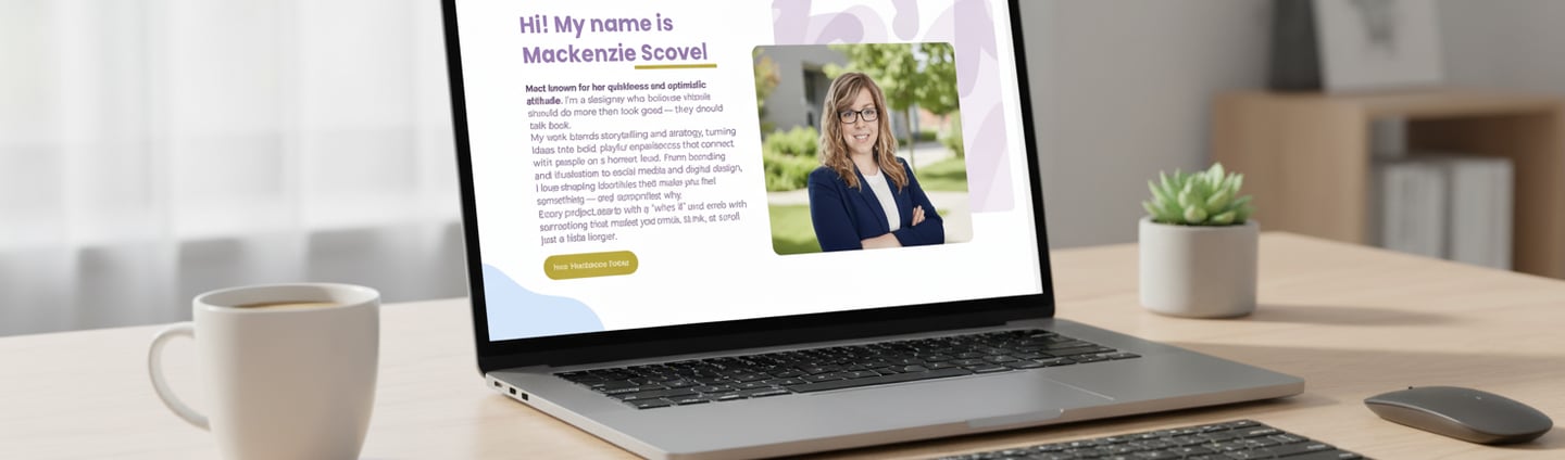
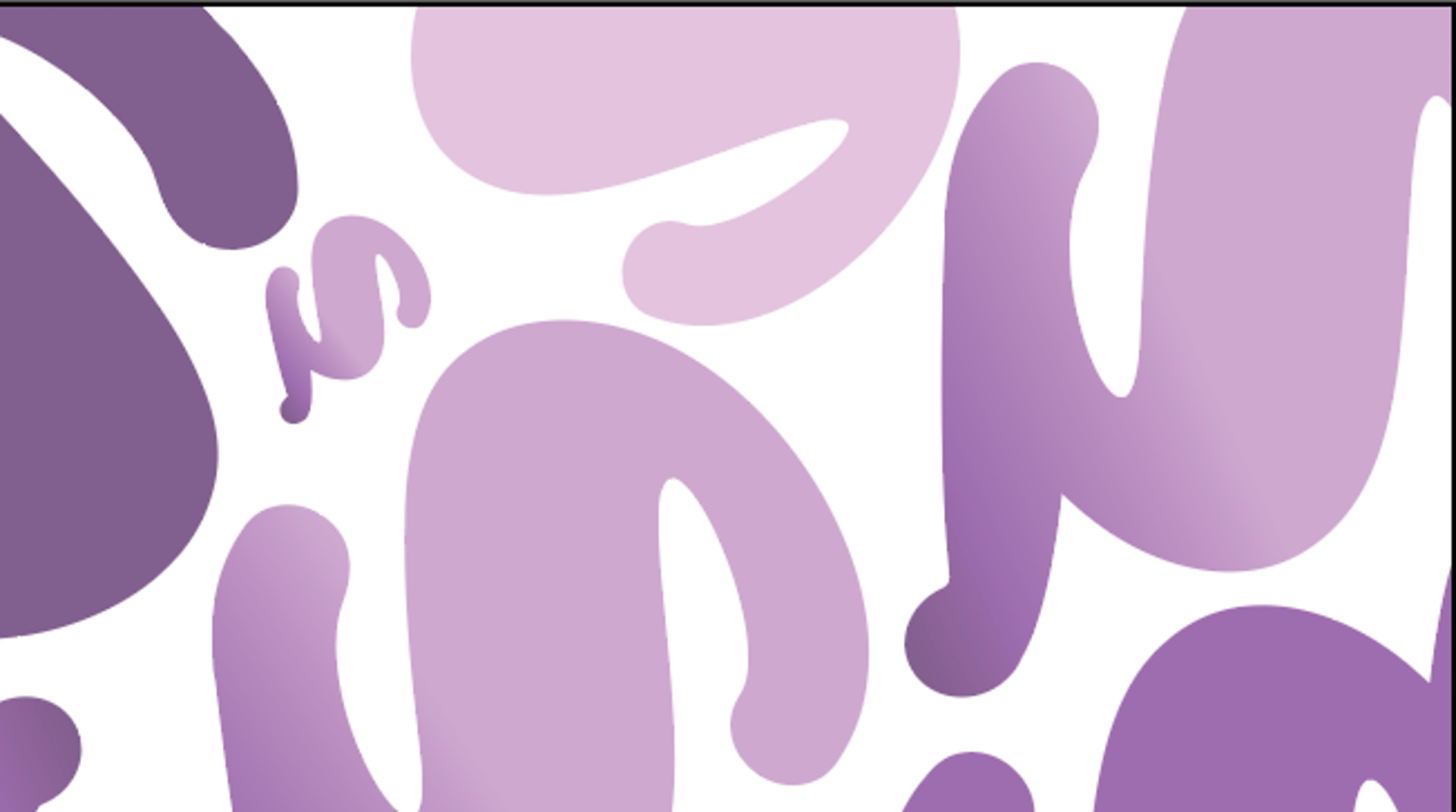
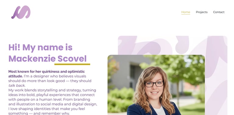
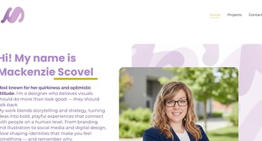
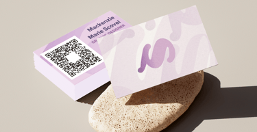
My logo is a custom monogram designed to be the single, flowing visual mark of my personal brand. It's a stylized, continuous form that suggests the letter 'M' (for MacKenzie), giving it an abstract, organic quality that feels approachable and modern. The monogram is also supposed to give you the illlusion of a sideway 'S'. I chose a soft, gradient purple to connect directly with the overarching optimistic and creative aesthetic of my website and resume.
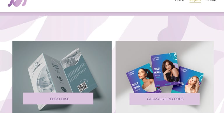
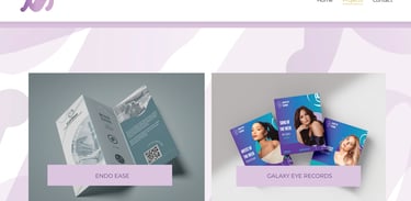
The design is meant to be more than just a literal initial; its smooth, flowing lines reflect the organic, playful, and versatile attributes I bring to every project. By avoiding sharp edges, the logo communicates a sense of creativity, motion, and openness. As a constant feature on all pages of my website (Home, Projects, and Contact) , it anchors my diverse body of work—from the professional layouts on my resume to the visual projects like "Endo Ease" and "Galaxy Eye Records" —with a single, memorable signature.

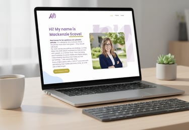
MOBILE
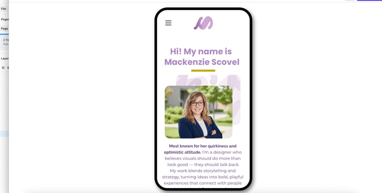
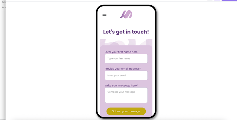
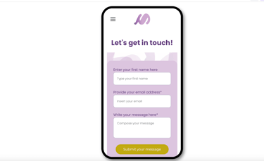
The layout itself is suppoed to be a direct extension of my optimistic design attitude. It uses a deliberate and sophisticated aesthetic, blending soft purple hues (pulled from my custom logo) with ample white space for a clean, professional feel. This visual branding is consistent across the site, from the large "Let's get in touch!" header to the project showcases like "Endo Ease." The structure is simple: I introduce myself, I show the work, and I invite collaboration. It’s built to not just display my projects but to convey the playful, yet strategic, voice I bring to every design challenge.
WEBSITE
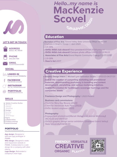
RESUME
BUSINESS CARD
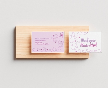
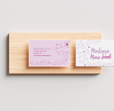
OLD DESIGNS
LOGOS
BUSINESS CARDS