GALAXY EYE RECORDS
Website Design | Logo Design | 2025

PROJECT
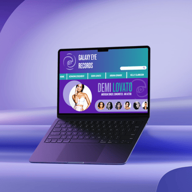
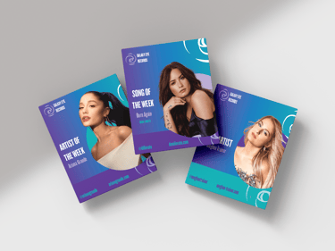
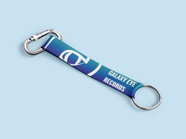
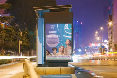
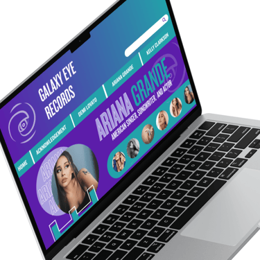
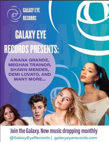
Galaxy Eye Records is a concept website crafted for artists with a focus on careers in pop music. The featured roster includes prominent names like Kelly Clarkson, Demi Lovato, and Ariana Grande, alongside Meghan Trainor, Camila Cabello, Ed Sheeran, and Shawn Mendes. Initially, the design palette incorporated a wide spectrum of galaxy-inspired colors. However, the updated aesthetic has been streamlined to focus on rich blues and purples, complemented by dynamic gradients, lending a more cohesive and sophisticated look to the overall design.

DESIGN DIRECTION
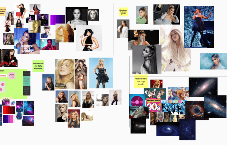
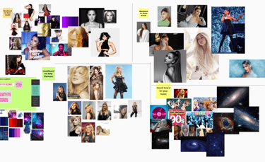
At the start of this project, we conducted thorough research to ensure the logo and name were original and free from copyright conflicts. I initially chose a color scheme of black, white, red, and grey. Later in the year, I decided to make key design updates that aligned more closely with the Galaxy Eye Records concept. I introduced a galaxy-inspired palette of pink, blue, white, and purple, which better suited the brand's theme. Additionally, the original design featured mostly pointed and rounded containers, but I found that incorporating more curved and circular shapes added cohesiveness and visual appeal to the overall composition.


ORIGINAL DESIGNS
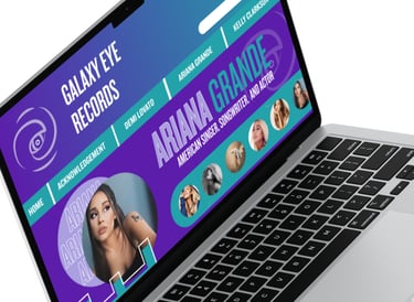
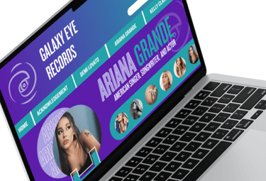

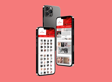
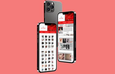
On the top, for the very first version I made for this project, I had only a fraction of the time during the school year to design this. That is why I made an effort to do a complete revamp of Galaxy Eye Records responsive website design during the summer months since. The first version of this design's color palette was reds, grays, black, and white and super blocky. I kept the original logo design, just changed the color palette.
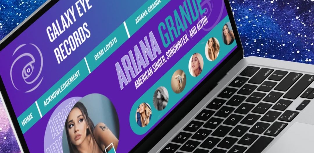
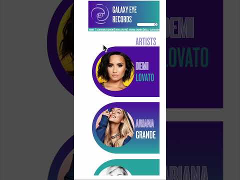
Then on the bottom was the version with galaxy color palette (pink, purples, and blues) and more visually appealing to look at. You got text on the sides and a carousel of photos for each artists.

VIDEO PROTOTYPE

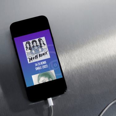
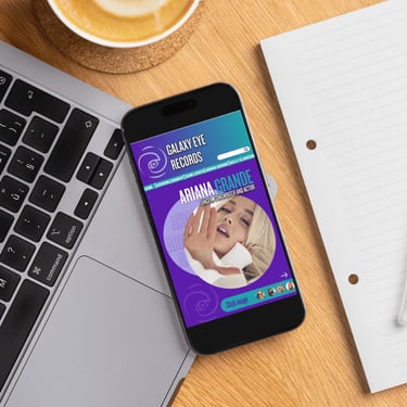
This mobile prototype for Galaxy Eye Records reimagines the music discovery experience for aspiring pop artists and fans alike. Designed with a sleek, galaxy-inspired interface and responsive navigation, the prototype showcases how the platform can live beyond desktop—putting artist profiles, new releases, and fan engagement tools directly in the hands of users. It reflects a bold, modern aesthetic while maintaining a user-friendly flow that aligns with the energetic spirit of the brand.

ORIGINAL LOGO DESIGN




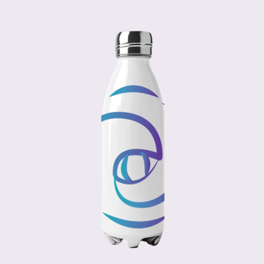
REVAMPED LOGO DESIGN
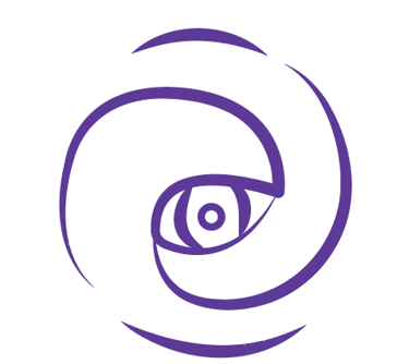

The original logo gave the interpretation of an eye joined in the galaxy style shape. This was when I just started designing, so the lines aren't perfect.
This is the revamped logo, same basic design, but I curved the lines more, so it can represent a galaxy eye a lot more.
